I need to use a tiny font on my display. What’s the ‘best’ looking font to use and/or how can I improve the font ‘look’ on the display?
How small is tiny? The HMI Font Pack has fonts as small as 12 pt. Can you a bit more specific in what your are aiming to achieve?
Do we assume you are using the latest version of the Nextion editor, 0.59?
And what is your display size?
It’s all relative.
On my 3.5" for a small font, I use Lucida Sans 16 Bold, anti aliased.
Yes, latest version of the editor. I’m using a 7" intelligent display, but want to use small fonts and want to avoid generating a ton of ‘samples’ to check each one to see what would look the best and be the clearest.
That is exactly what the HMI Font Pack is for. Did you check out that link? It has hundreds of precreated .zi V5 anti-aliased fonts and includes preview PNG file as well of each font.
Doh! Skipped right over that link. Thanks! I’ll check it out.
I used the HMI NotoSans-Regular 26 (UTF_8).zi font file to display some numbers and experienced the following problems.
A text field with a value like this 10’ 9.50" would be mapped to the display using that font as 66.470 Both the formatting and the value were completely wrong.
A text field with a value of 6.73 m would show up as 6.73m on the display. The space between the number and letter was removed.
Sorry, I cannot reproduce the issue you are describing.
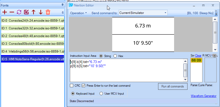
How are you sending the commands? Do other fonts work properly?
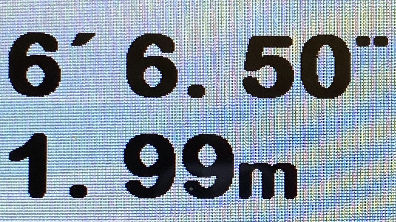
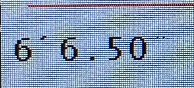
The distance page looks like this using Font ID 3.
Those results then get assigned to text objects on other pages.
p[12].b[stdindex.val].txt=standard.txt
p[4].b[metindex.val].txt=metric.txt
Normal fonts appear as expected: (below)
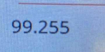
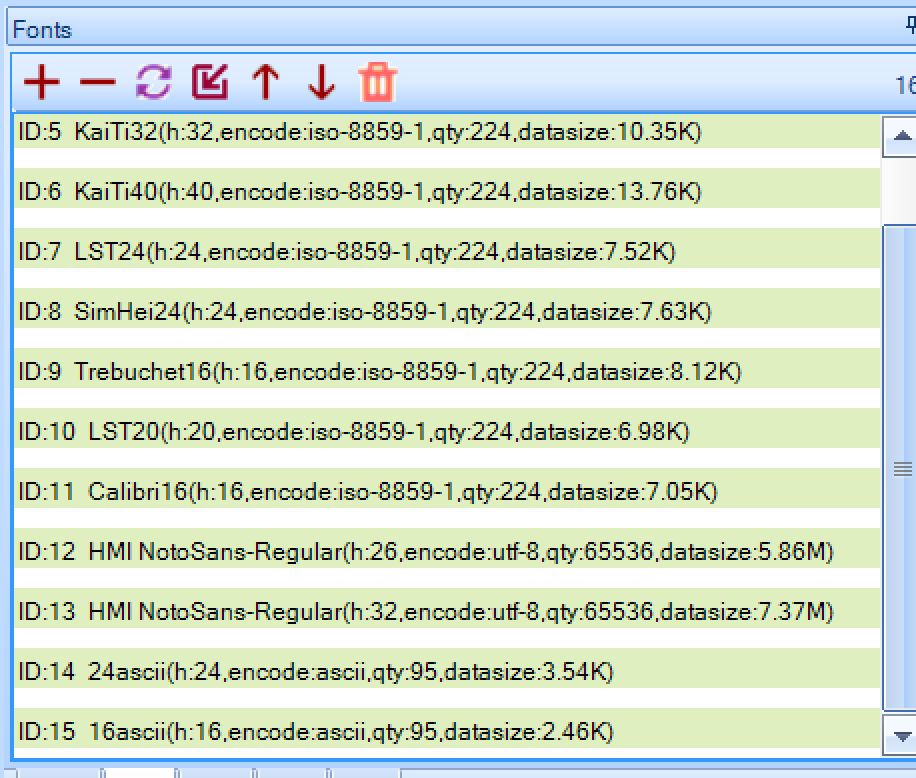
If I use Font ID 12 (list of fonts below), the ‘standard’ page 12, looks like this:
Seems the other fonts are in iso-8859-1, so it’s better to use Noto Sans in the same encoding to exclude encoding issues.